There is a lot more that goes into designing a magazine than one might think when glancing at a cover or flipping through pages. Each design detail requires its own thought process, even those that one may not immediately notice are chosen for a purpose. Some of MacEwan University’s design students can tell you just how methodical and strategic the planning and work of creating a magazine design really is.
In the Winter 2020 semester of Publication Design, a third-year Bachelor of Design course, students were tasked with giving the griff magazine a revamp. The students select content from past issues of the magazine and create a new direction with their own choice of style and tone based on what they have learnt. Each student has complete control over their design and the ability to put their personal style into the publication. Once the project was completed, the griff staff voted on their favourite magazine designs and selected the top three.
Kate Hughes is one of three students from the class of 22 whose design was selected by the griff team. Hughes was first inspired to join the program at MacEwan because of her interests in creative thinking and human-centered problem solving. “As a visual thinker and artist, I want a career where I can not only have creative freedom, but work with a variety of people with diverse ideas,” she says.
Her initial goal going into the project was to make the magazine more engaging for students. “When walking by the magazine stand at school, there are students that don’t get an impulse to pick it up and see what’s inside, so I wanted to change how students viewed the griff as a whole.” She also wanted students to feel more excited about MacEwan life, and have the magazine act as a destressor from mental pressures that come with school.
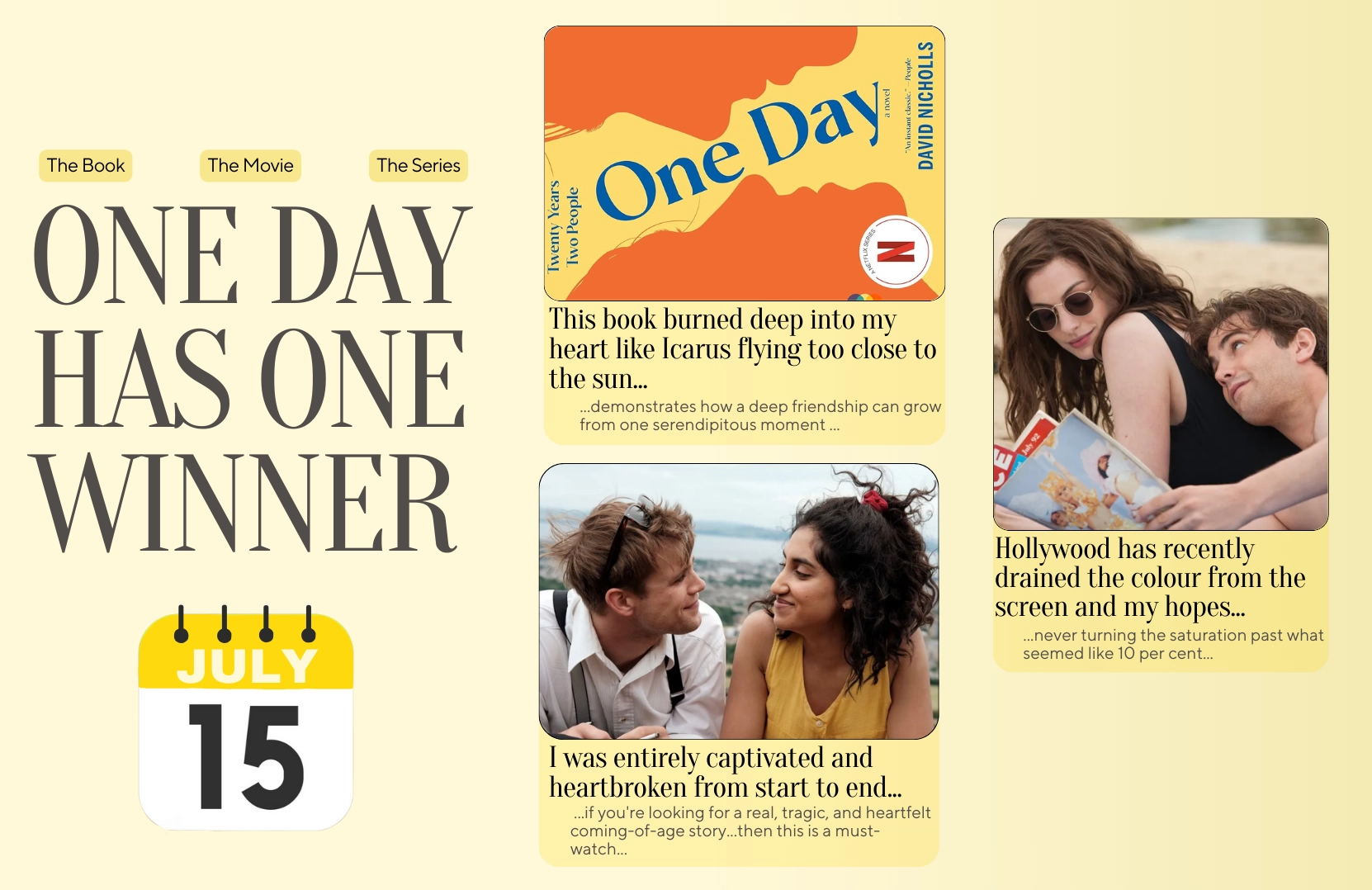
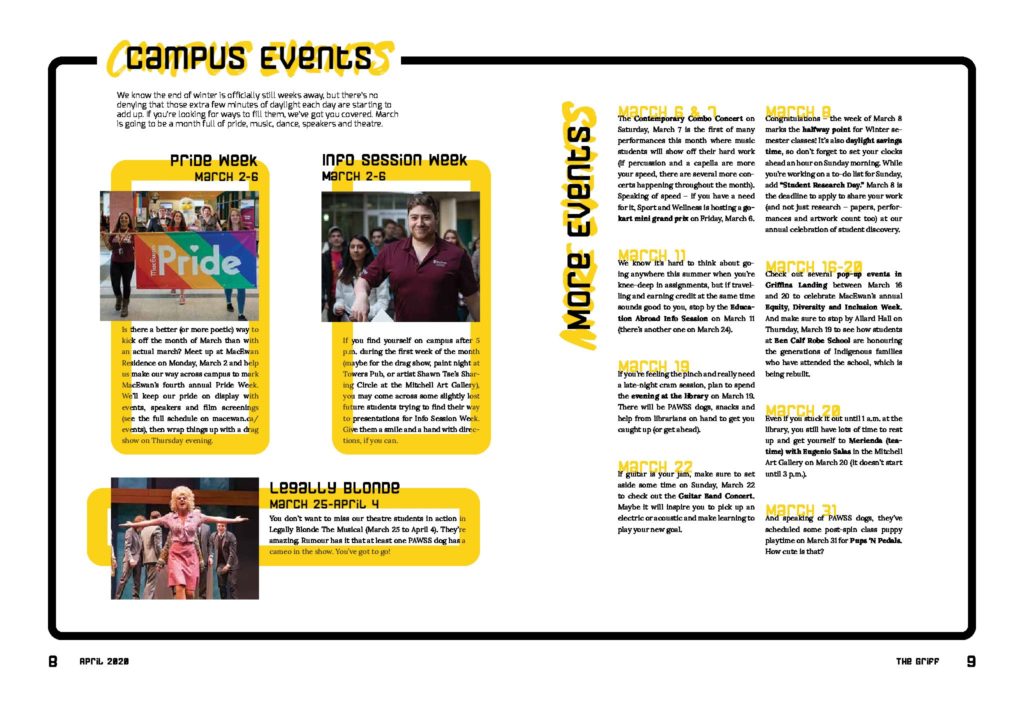
Hughes attempted to bring more life and personality to the magazine by using rectangular graphics, bold typefaces, and slanted images. Her yellow colour choice aims to make readers feel more uplifted and excited. “This colour is consistent throughout the magazine to not only keep it cohesive, but to maintain a cheerful mood,” she says. Hughes also used two shades of blue throughout, which she says, “creates a compelling contrast and balances out the aggressive and passionate feelings of the yellow.”
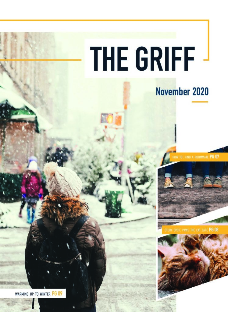
As for her cover image, Hughes says she wanted one that was similar to what many students experience — something relatable. “The location is similar to MacEwan’s downtown area, and the student walking in the snow is relatable.” Her cover page also gives a sneak peak into what is inside to try and grab the reader’s attention and make them want to read.
For Hughes, she says a challenging part of magazine design is working with text. “There can be many limitations if the amount of text is too short or too long. Another challenge can be mixing up the layout to keep the reader engaged, but not changing it to the point where consistency is lost.” However, she says she loves typography and working with text. “There are consistency and spacing limitations in magazine design, so that leaves lots of room for creative problem solving.”
“Reading articles can also be tiresome sometimes, so determining how to make the reading process more entertaining is enjoyable,” says Hughes.
Cam Zimmel, one of the design students also chosen for his artwork, decided to create a cover that was unique. He drew inspiration from WIRED magazine, known for their quirky, people-based front covers and distinctive spreads. “Dynamic, relevant, and intrigue were the three words I used to describe how the new version of the griff would look,” says Zimmel. His creative process started with research on various other magazines, and he used the inspiration as a platform. “After researching, it was fairly easy to begin to form my own interpretation of a design system based on the original words,” says Zimmel.
“There is so much room for creative freedom once you know what kind of content you’re working with,” says Zimmel. He feels that magazines tend to be a nice blend of typography and images interacting with each other, “so it is a great outlet to practice layout design,” he says.
For Zimmel, He says that a crucial aspect to a good magazine is its cover. “Readers would likely pick up a magazine that has a compelling cover and explains a little bit about what they are going to expect rather than not knowing at all.” For his magazine, he wanted to find a colour palette that would work with the vibe of the magazine. “I think it feels quite energetic, and the colours help emphasize that, as well as divide the magazine into sections.”
Zimmel says the reason behind the cover was that “it popped.” He wanted to capture the students’ attention and keep them hooked throughout the magazine. “The image and layout of the magazine was meant to reflect the kinds of images that could be used in the future, composed and vibrant,” says Zimmel.
Creating a cohesive design for the magazine was the hardest challenge for Zimmel, “Especially when you try to incorporate a variety of spreads for different kinds of content.” However, Zimmel mentions that once the design is “tightened and refined,” the process becomes easier.
As for the reason behind the revamp, he believes that the magazine felt a bit stagnant as it is and feels that a little push is needed for the students. “There is no doubt that the layout is very clean and refined, but there are no real creative liberties taken throughout from what I’ve seen. It almost feels a little too cookie cutter for the environment that the university (specifically SAMU) is trying to endorse.” Therefore, he thinks that the magazine design needs to be more “energetic and lively,” keeping the readers excited and still being easy to read the articles in them.
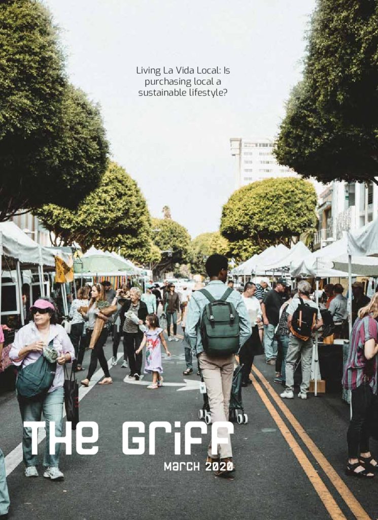
Taylor Yuill’s initial plans were to pursue a career in animation, but she realized through taking an animation course that she did not have the patience, but loved working creatively. Yuill created a magazine cover that was inspired by bold and fun cookbooks, and large murals that were present in downtown Edmonton. “They use such bold black lines and fun fonts that give a modern urban feel. I was also inspired by neon signs with their bright colours and vintage vibes,” she says.
Her interest in magazine design came about because of the constant change that went into creating one. “I really like that fast-paced world,” she says. Other than that, the creative challenge also interests her. “You need to incorporate photos, text, hierarchy, and pull quotes in a couple of pages so it looks cohesive and put together.”
Yuill was very excited when this design project was assigned by her professor. “The current design of the griff has a very chill and relaxed feel to it, and I wanted to amp it up and bring something big and bold to the magazine.”
For Yuill, she says that the reason behind her yellow stand-out colour choice in the layout was because she loves it. “I feel like it’s very fun and whenever I see it, I gravitate towards it immediately. It also compliments the bold black outlines that I used throughout.” She wanted the magazine to have a contemporary urban theme, incorporating warmth and brightness, hence, the yellow. “I used the motif of the bold outlines to give the feeling of a picture frame. I wanted this to give the illusion that the reader is seeing the articles through a picture frame or window.”
“The title, the author name, the body text, and the pull quotes should all stand out on their own and have their moment. If you don’t have that, your articles can start to look cheap and not well put together,” says Yuill when talking about the most important aspects of magazine design. She chose the cover image of a farmer’s market, because of the main story in the magazine. “I wanted to link the cover back to the main article as well as have it relate to the downtown Edmonton scene.”
Though Yuill appreciates the current look of the magazine, she still felt that some changes needed to be made. “As much as I like the design now, I think the griff needs something bold, quirky, and loud. There is never a dull moment at MacEwan, and I want that to be represented through our student newspaper.”
Images supplied.