Each year, the griff partners with MacEwan University’s growing design program, where students get a chance to reimagine the layout of our campus magazine. The contestants take every detail into consideration, from textual readability, aesthetic visual design, flow, and image placement.
In collaboration with the griff’s managing editor and design editor, the students used prior examples and applied their vision to a new design, breathing new life and visual novelty into their own unique reconstructions.
Publication design is a course offered at MacEwan where students are encouraged to think outside the box and apply their knowledge to change the face of print publication layout.
Malorie Lafond says she approached her redesign by combining imagery to create a clean and inviting look. The illustrative elements combine bold coloured text and bold coloured imagery that add a playful and engaging feel to the magazine, something she says the old design lacked. “ “There is a very light and airy feeling to the magazine. With the reader in mind, the layout was given lots of white space and room to breathe so that students can quickly glance and skim through the magazine.”
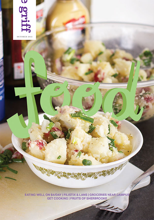
Lafond utilized this approach for an issue about cheap food recipes and student food choices on campus, something she saw as needing to be more casual and airy to skim through so students can get something of value from a quick glance.
Summer Shields designed her project with the intention of harmonizing the articles themselves with the visual design — something she sees as being disconnected. “When beginning this project I thought about what I found, as a student, to be a frustrating part about magazines in general; what I thought of was how unrealistic and unrelatable many pop-culture magazines could be. From the flawless image on the front cover to the content that suggests we need to implement unrealistic habits into our lives to be happy, I found that the fact that I couldn’t relate to the magazine to be the problem I wanted to help solve for students in the griff.”
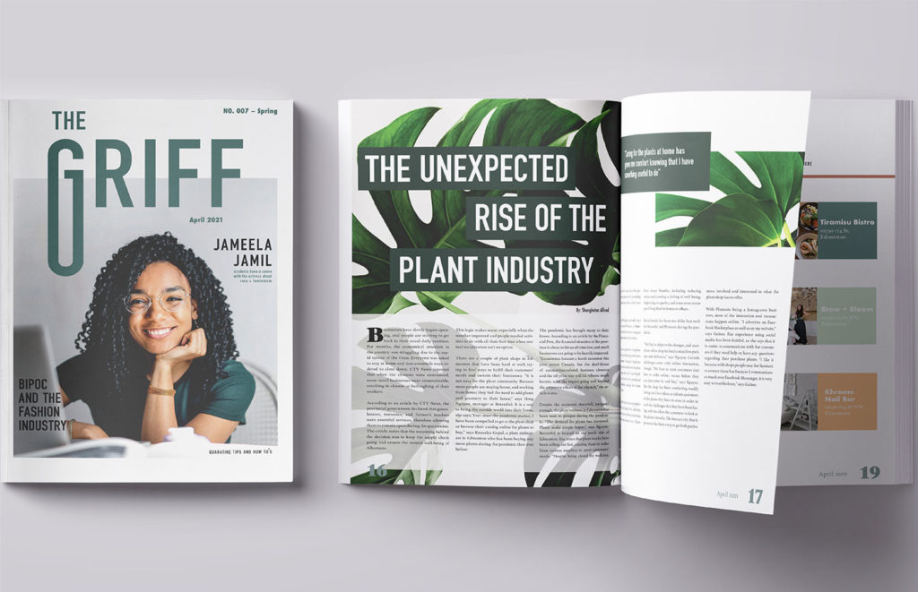
Shields said she views the written work in the griff to be applicable to students, and she wanted to mirror this in her design, using warm colour palettes, playful text layout that draws the reader in, and ean white spaces for a polished look.
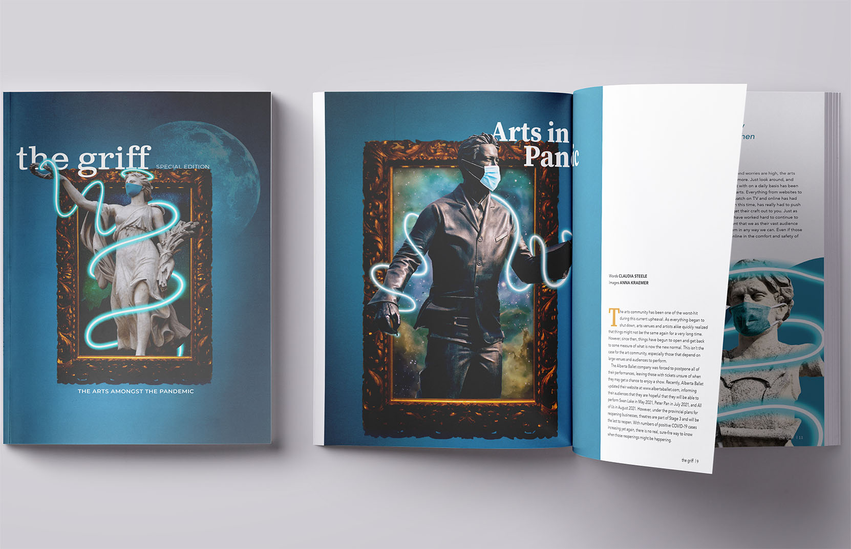
Anna Kraemer, the competition’s first place winner, based her winning design off of an article from September 2020, titled “Arts in a Pandemic.” She chose to base her design off of this article as it reflected the seriousness of COVID. “Despite the serious nature, I decided to make the magazine’s overall design and tone fun, simple, and modern. My goal was to create a light flow with the essence of the underlying tones of seriousness, calmness, and the elegance of traditional art forms.”
She said her goal was to make the overall design of the magazine playful but simultaneously provoking serious curiosity. “This reflects the reality of our student life. As students, we are serious during our school career, and yet seek relief from the intensity.” She achieved this intended effect through combining statue imagery, vintage black and white photos, old fashioned framing, and contrasting it with neon squiggles throughout the magazine.
Images supplied. Cover image: Anna Kraemer’s winning design.