Here’s your annual poster roaster!
Luis Ruiz:

— It’s like he’s showing his ID for the first time.
— He’s like the epitome of someone who says, “I’m just happy to be here.”
— This is for sure the first of many photos abusing the new building to get votes.
Micheal Ziegler:
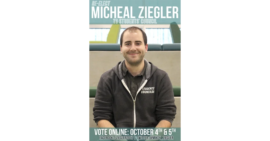
— I like that he’s wearing his student councillor sweater. He’s really hammering home the “re-elect” part of his campaign.
— His face says, “I’m probably going to win.”
— You can expect the same results from him every time — just like the monochromatic colour palette of his shirt and sweater.
Andrew Bieman:
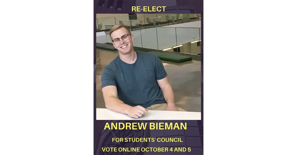
— He kind of looks like someone was watching him take the photo, but he just posed anyway.
— He’s like those pictures of Ryan Gosling. “Hey girl, vote for me.”
— “Feel this sweater. It’s made of councillor material.”
Rachelle Drummond:
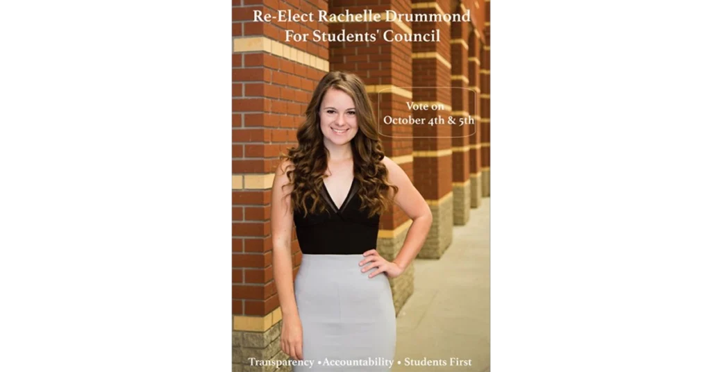
— The pose is very Grade 9 grad.
— She’s the first to use Building 5 as a backdrop. “Remember where we come from at MacEwan.”
— She’s got all the buzzwords at the bottom. Maybe if you don’t include them, it means you don’t believe in integrity.
Nicolas Powers:
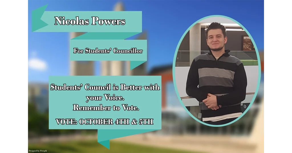
— This appeals to my sense of nostalgia. It’s like a high school council poster.
— He looked at the photo of MacEwan and thought, “How can I mess this up?”
— He’s in the new building, but the background is the old building. So he’s bridging the old and new sides of MacEwan.
Sophia Qaderi:
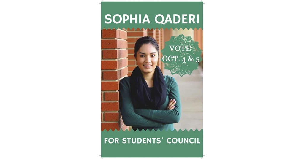
— Her arms are crossed. She’s nailed the power pose.
— The stamp beside her with the dates looks like one of those scratch cards. What do we win if we vote for her?
— She looks like the person you want in your group project.
Vanessa Sheppard:
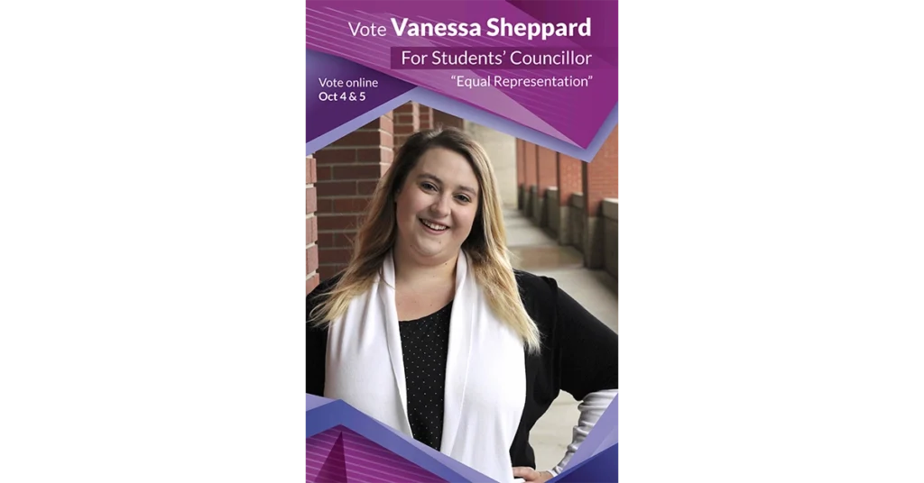
— Why is “equal representation” in quotation marks? What does that mean?
— It’s a good philosophy to have, but the quotation marks make it seem really sketchy.
— Does every female candidate have to pose in front of the brick wall?
Spencer Newton:
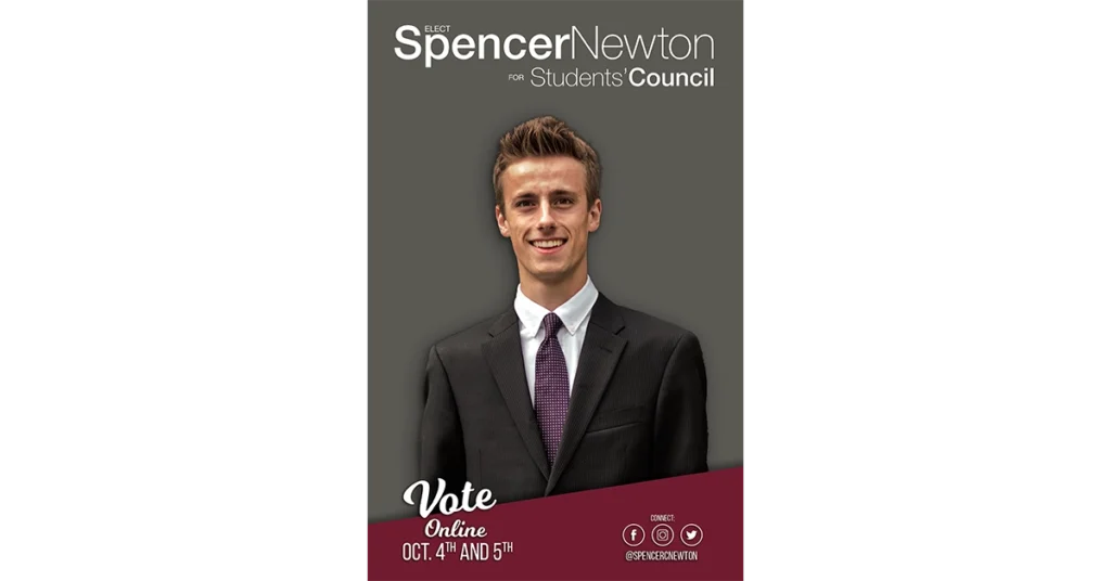
— He’s the first one to use the MacEwan maroon colour.
— It looks like the cover of a textbook.
— He just cropped himself out of a good photo and put in the grey background. Maybe he cropped out his ex-girlfriend.
Jacob Marler:
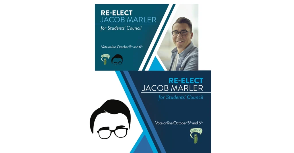
— He stole “I’m Pickle Rick!” Does he have the legal rights to use that?
— He nailed it with the logo of his hair and glasses, but ruined it with the pickle.
— Are you the pickle or the man?
Aubrianna Snow:
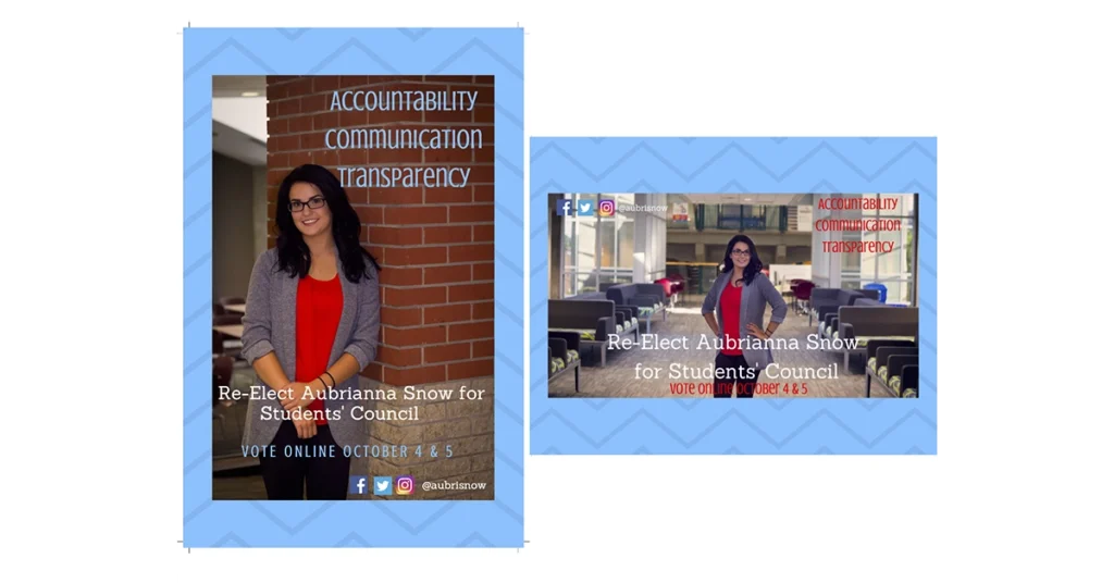
— It’s such a good photo, but she ruins it with that background.
— She definitely Photoshopped another photo of herself onto the pedway.
— The background is like something you would get on a preset Twitter theme.
Sylvie Masson:

— This is definitely just a selfie. It’s like she was about to jump in the shower, but she loved her makeup so much she just had to take a picture.
— Her colour scheme is definitely Christmas. She’ll make all your Christmas wishes come true.
— There are five different fonts on this poster. The curlicue one really adds to the Christmas theme, though.
Tansy Spyker:
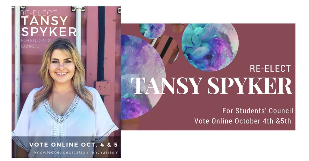
— She’s a little bit country, but those cosmic balls scream rock ’n’ roll.
— She went to a high-school graphic designer and said, “Make it look like I work at Lush, but also care about the universe.”
— “Tansy Spyker: She’s outta this world.”


0 Comments