Ah, it’s that time of year again. Posters all over the walls at City Centre Campus. Candidates visiting CFAC for the first time, just to throw their face all over the (very little) space for posters that exists there.
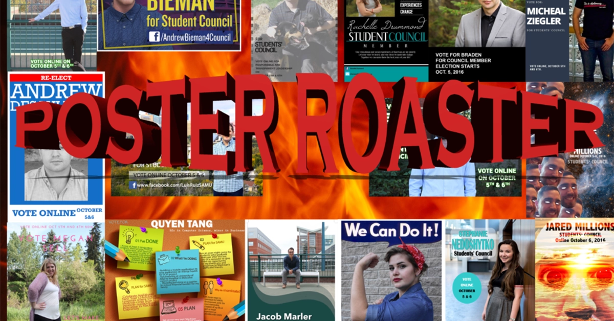
Some of these faces, which you may not have ever seen in your life prior, are running to represent you in student government. It’s up to you to make the right choices — and we felt like it was up to us to make fun of them.
Thank you to all the candidates who sent their posters to us, and best of luck. You guys make our jobs fun.
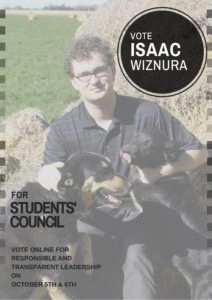
Issac Wiznura
Rachelle Drummond
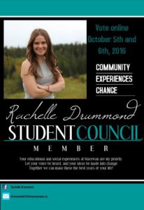
“It looks like a wedding invitation.”
“Or maybe it looks like a LinkedIn page.”
“She spelled priority wrong. :(“
“Kinda like the power stance.”
“She really gave a lot of real-estate for her Facebook and email notes and they are so small.”
Andrew Bieman
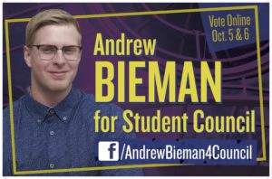
“This looks like a still from the Bill Nye credits.”
“This is straight from the ’90s.”
“Reminds me of YTV — kind of like it would be a prank show.”
“‘Next up, Spongebob Squarepants, followed by PRANK’d with Andrew Bieman! Stay tuned!'”
“He looks like he kinda just crept up beside his name.”
“I think this is probably the best-designed poster we’ve seen.”
Braden Mole

“According to his poster, he doesn’t have a last name.”
“He’s very professional-looking.”
“This is like a glamour shot.”
“He kind of looks like Keanu Reeves a bit. Love Keanu Reeves.”
“This looks like a photo you’d see on the Bachelorette.”
“He looks older. Like his wife took the photo and his kid made the poster.”
Micheal Ziegler

“Is he.. Is he posing in front of the bathroom?”
“This looks really last-minute.”
“Under all the posters, we get scenery, scenery, 90s, and then boom. Bathroom.”
“Should I keep my bangs? y/n”
“From this picture, it doesn’t look like he’s challenging the status quo.”
“Maybe he’s challenging the status quo by not wearing a suit. I think what he’s wearing is probably what student councillors would actually wear.”
“He looks like he’s cropping himself out of the photo.”
“The thumbs-in-the-pocket look is definitely a favourite.”
Jared Millions
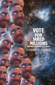
“Good try.”
“How can our roast be real when his eyes aren’t real?”
“Is his last name actually Millions?
“I would have tried to put a million of my heads on there, not like, 13.”
“He actually talked to people to put these here.”

“This one, like the other one, caught my attention, but after that I was just like, ‘ok.'”
“I’m not sure what else to say about this one — it’s definitely eye-catching, but that’s about it.”
“Even if he is a joke candidate, I don’t actually think his posters are funny.”
Stephanie Nedoshytko
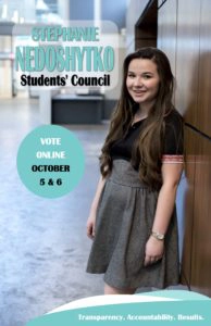
“‘Transparency. Accountability. Results.’ BUZZWORD ALERT!”
“She looks really young, but she also looks really sweet.”
“Results? We should probably just vote for her — results sound good.”
“The watch (and area) is a little blurry. How can we trust a student council candidate that can’t even tell the time?”
“This poster is great. One of the best-designed ones.”
Tansy Spyker
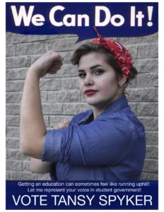
“It feels like there is one of these posters every year. I hate memes.”
“She definitely has the most badass name.”
“She’s kind of yelling a lot on her poster.”
“She looks like she could whoop my ass.”
“I wonder how many people think post-secondary is like running uphill? Or like running stairs? Vote Tansy Spyker for less stairs.”
Luis Ruiz
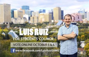
“Inspirational.”
“This looks like he should be running for city council, not student council.”
“Today, MacEwan. Tomorrow, the world.”
“He just looks so happy to be here.”
“He always looks like he’s laughing at a joke of some sort in all of his posters and it really makes me mad that he won’t fill us in about what that is.”
“The shirt kind of matches the buildings.”
Jacob Marler

“Check me out on Instagram only.”
“Just a happy lil’ fella.”
Did he lose a button?”
He looks like he’s asking me, ‘Why don’t you come sit over here, champ. Just have a seat.'”
“The design looks like toothpaste.”
“He’s got good hand placement.”
Quyen Tang
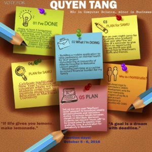
“Where is she? Is she a post-it note?”
“I like the inspirational quotes on the sides.”
“This is just a huge wall of text.”
“At least we know she has a lot of plans!”
“It’s very busy.”
“There is just too much going on here for me to see the poster and vote.”
Henry Smith
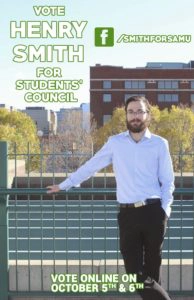
“He looks like he’s waiting to take me to prom.”
“Or maybe he’s a gatekeeper.”
“He looks like he’s about to ask me if I had a reservation.”
“Great beard.”
“I like the font, but only because it’s kind of awful.”
“This one is miles better.”
“The photo in this one is much better than the one previous.”
“This one looks like a band photo. Like it’s his bio on his band’s website.”
“He always looks kinda bummed, even with the half-smile. ‘Students’ Council is a grave affair.'”
“He looks like a dad. Or your mom’s date.”
Megan Sell

“Dang, she’s got sass.”
“The text is incredibly hard to read.”
“I think bashful is a pretty great word to describe this.”
“It doesn’t say what we are voting for anywhere on here — it’s so confusing!”
Andrew Desaulniers
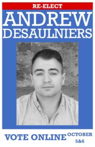
“This looks like a picture that’s on the cover of his album that he can only sell to his friends and family.”
“Or this might be an Abercrombie ad.”
“Or this might be a wanted poster.”
“Or this might be a rejected passport photo.”
“Or this might be a blown-up version of his license picture.”
“I wonder why he chose the American route? Kind of looks like he’s trying to channel his inner Obama.”
“I like how he shaved but left a little stubble. Like, ‘yeah, I can grow facial hair, but I chose not to because I’m transparent.'”



0 Comments