Lauren Beatty
This redesign of the griff serves as a reintroduction edition to students. Most current students need to become more familiar with the griff since they began
their post-secondary journey during the pandemic. The purpose of this redesign is to allow the griff to make itself known as the magazine that is made for students by students through its new quirky, fun and playful design.
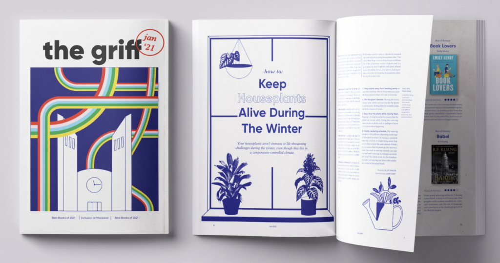
Two typefaces make up the system, LoRes and Puffin. Together, they create a design reminiscent of the ‘90s and early 2000s, providing a nostalgic reading experience for users. The uniqueness and quirkiness of the system invites readers in with a relaxed atmosphere and curiosity waiting to be quenched. Plantin is used as the body font for an easy, peaceful reading experience, contrasting with the out-of-the-box title fonts.
The imagery in this magazine is treated with a pixelated overlay, referencing pop art and old comic books, adding to the playfulness already established by the type system. The fuzziness of the images will intrigue readers, pulling them into the articles. The paper texture and collage used throughout mimic how
students leave sticky notes on almost everything they touch and add to the layouts’ dynamics. The small, bright pops of colour also add to this and are done to direct attention towards the type and articles waiting to be read.
Overall, this redesign will appeal to all students through its playful, nostalgic design that will encourage readers to pick up a magazine, get familiar with the griff, and become regular readers.
Laura Caney
This magazine redesign of the griff is inspired by the youthful energy of MacEwan University students and aims to become a place that recharges and re-inspires students during the stressful school year. It takes inspiration from indie, handmade zines and contrasts them with organized grids and a minimalist type system reminiscent of editorial magazines. The result is an authentic magazine that is easy to read and offers a sense of clarity despite its loud colours and patterns. The beauty of the griff is that it is ever-changing due to the rollover of students, and by keeping a type system that is neutral and friendly, it can withstand the changes in styles and trends that the graphics will inevitably go through.
The issue features various textures and techniques, Zine-inspired graphics and illustrations, and paper textures. This combination captures the essence of a handmade zine but in a clean, organized format. The limited but bright colour palette works to be the charging force of the magazine, keeping each page exciting and cohesive.
The primary header type is Gilroy, a geometric sans-serif with rounded features that is friendly and welcoming. In the system, keywords are outlined in the primary blue used throughout the spreads to bring more interest to the piece. It is contrasted with Plantin italics, an old-style serif that adds an elegant edge to the magazine. This exact pair is utilized on the cover to give off a modern, clean aesthetic and has the date stamped over the top as a nod to the inside hand-made illustrations. It is paired with featured artwork from the feature article. This unites the magazine and spreads cohesiveness.
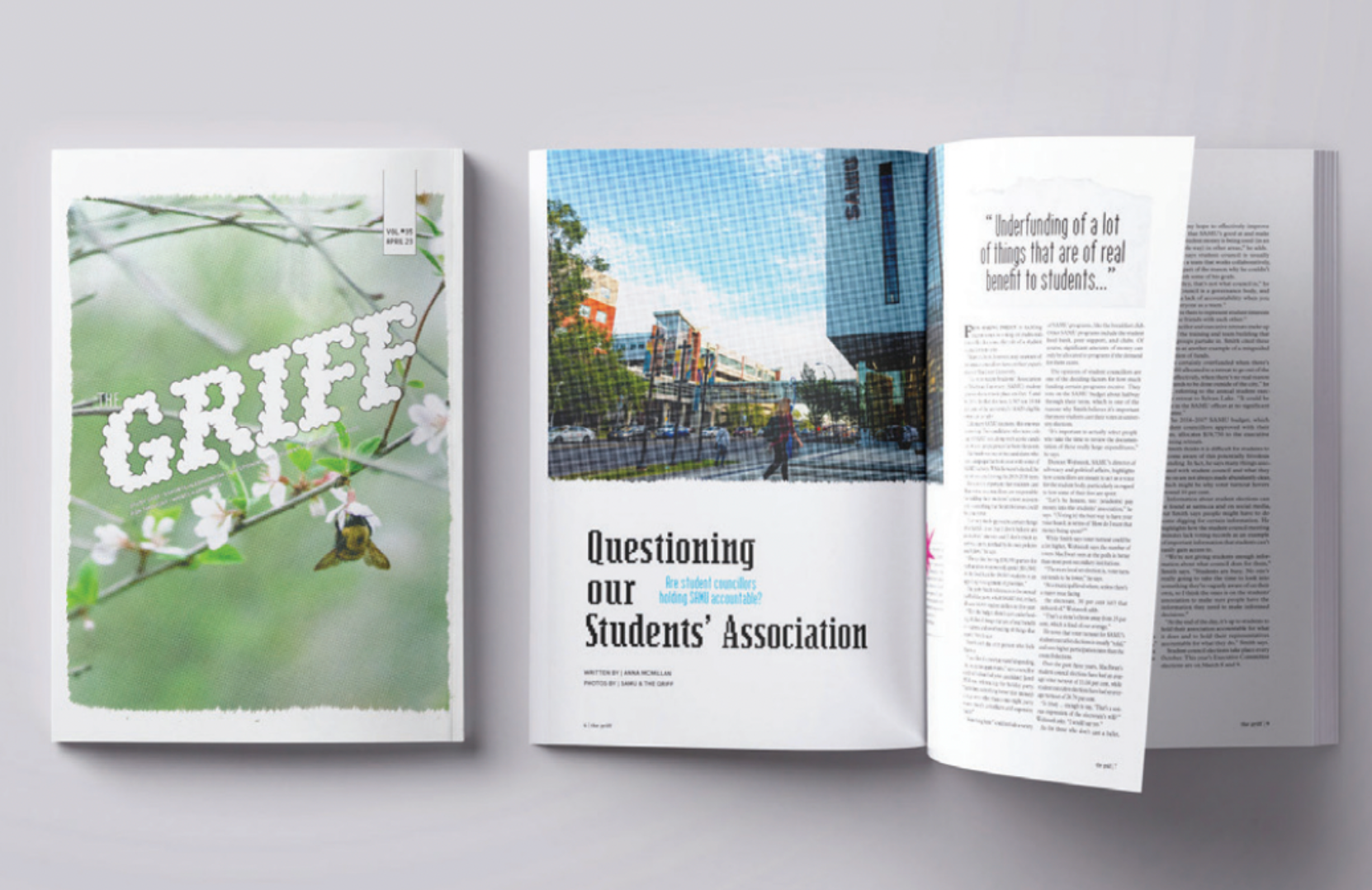
Elise Cheung
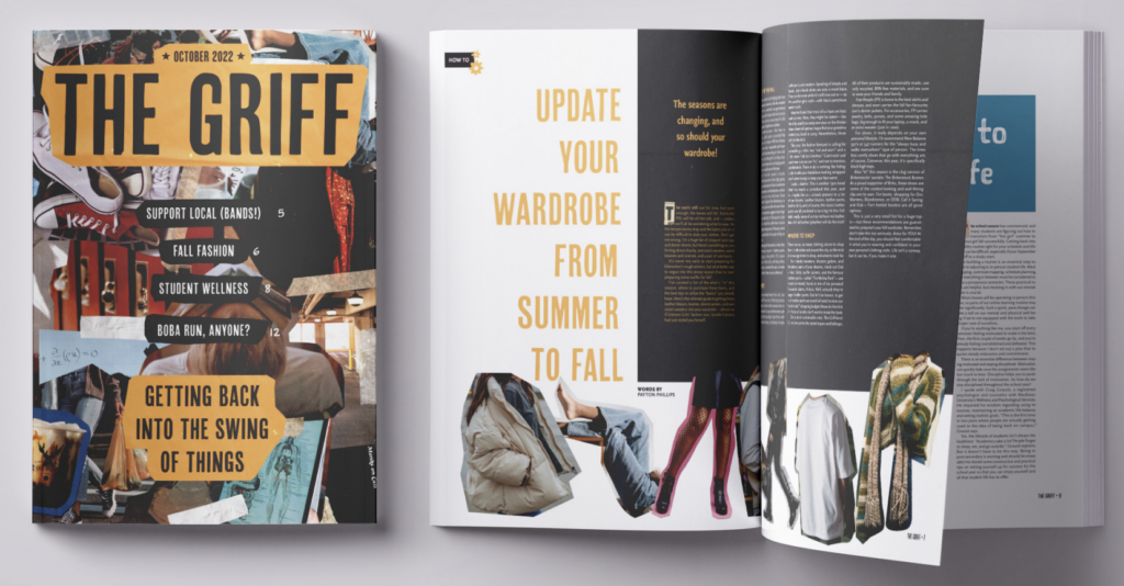
This visually reimagined issue of the griff’s October 2022 release takes on the aesthetic of a “clean zine.” The goal is to position the griff as a piece of content made for the students by the students. To do this, collage elements such as paper textures and cutouts are used to inject the notoriously unapologetic authenticity of a traditional zine into MacEwan hallways. The catch is that, because this is a “clean zine,” each page remains thoughtfully designed regardless of how random layouts may appear at first glance. While there is a lot going on, there is a clear underlying visual system at play. This sets the griff apart from the average zine and establishes it as an official publication while still leaving room for lots of fun to be had.
Each monthly issue will feature a collage on the cover with images relevant to the contents of the magazine. An overarching title for the month gives readers an idea of what to expect as a whole, and short, fun call-outs with page numbers hint at specific articles inside. The collage’s palette and nameplate colour set the visual tone for the issue’s interior to follow.
Inside the publication, the table of contents introduces the “clean zine”’s typeface system. A collection of five different typefaces work together in a succinct hierarchy to accommodate a collage aesthetic. Handwritten typefaces add personality and fun, while cleaner, bold fonts provide grounding contrast and accommodate more serious subjects. Small, yellow doodle symbols indicate signature content sections, such as the Creative Spotlight, and reappear on corresponding pages to help readers navigate through different articles.
The large format of the griff allows for wide margins to balance the visual closeness and layering of shapes and textures. This makes articles easier to read and helps content-rich pages to avoid looking cluttered. Funky shapes from cutout images contrast clean blocks of text in articles. This format lends itself well to designing layouts for a range of topics and keeps readers engaged in each article from start to finish.
“Clean zine” making requires a sort of careful randomness that allows for professionalism to adopt a carefree spirit without losing its polish in the process. This redesign shows what that balance could look like and offers MacEwan students an unfussy, “take-me-as-Iam” piece of content to look forward to picking up each month.
Heidi Gorner
The re-design of the griff is bold, colourful, youthful, and structured with visual inspiration from ‘90s graphic design. I specifically chose to incorporate ‘90s graphic elements as there is a strong nostalgic allure towards ‘90s and 2000s design, art, fashion, and culture from the university-aged demographic who wish to return to a “simpler” time, a time of their youth. The magazine incorporates the ‘90s graphic design aesthetic by using two typefaces, Fairplex Narrow and Program, created by type designer Zuzana Licko of Emigre Graphics, which came out of Emigre magazine, a quarterly magazine published through the ‘90s.
The magazine nods to early DIY “zine” culture through fades, textures, collages, and distress. Through photo manipulation, the griff can add visual interest to the corporate nature of the stock imagery most accessible to a student-led magazine on a budget. The colours are also reminiscent of vintage print, as they are bold but slightly muted to give an aged look.
I chose to balance this by adding a structured grid to maintain the professional feel of a university magazine that mixes fun, silly, serious, and academic material, allowing the aesthetic to be appropriate for both extremes. The clean structure and hierarchy allow for an explicit and easy read that does not overwhelm the reader. In contrast, the imagery and graphics are fun and dynamic to combat a stale or heavy feel. Each feature or section of the magazine includes a new use of colour to signal its separation to the reader.
Seraphim Rosenfeldt
This refresh of the griff focuses on capturing and expressing the passionate and confident spirit of the students reading and creating it. Bright colours, stark and bold graphics and images, and a constant play with the grid create a dynamic and youthful feeling to the magazine while maintaining legibility and being an enjoyable read.
The stylization of images within this redesign of the griff accommodates a wide range of adaptability. It lets editors of future issues follow the style without having the tone of the articles feeling disconnected from the tone of the publication. The use of stark black and white images and geometric forms in bold colours are easily adaptable to most pieces that writers for the griff are creating, reflecting the passion writers and readers have in connection to the work and research they are doing at MacEwan.
The type choices within reflect the energy and ingenuity of MacEwan students. The only typeface used throughout this redesign is Degular, split into Degular Text, Degular, and Degular Display. This typeface takes a modern steadfast category of type (the neo-grotesque) and experiments with its forms. Angles are slightly more pronounced, the x-height is taller, and variations go from extreme thicks and thins, creating a more dynamic experience than traditional neo-grotesque typefaces like Helvetica and Arial.
The colour scheme of this issue of the griff utilizes primary and secondary colours. These colours draw the reader’s eye and reflect the energy and confidence of MacEwan’s students. They are used individually in each article, helping to differentiate each piece of writing from one another. On the cover, they are used together to draw people’s eyes as they walk on campus from class to class.
Kaitlyn Tupper
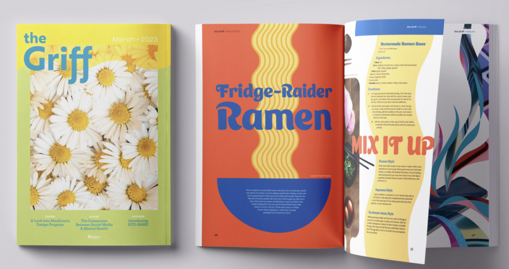
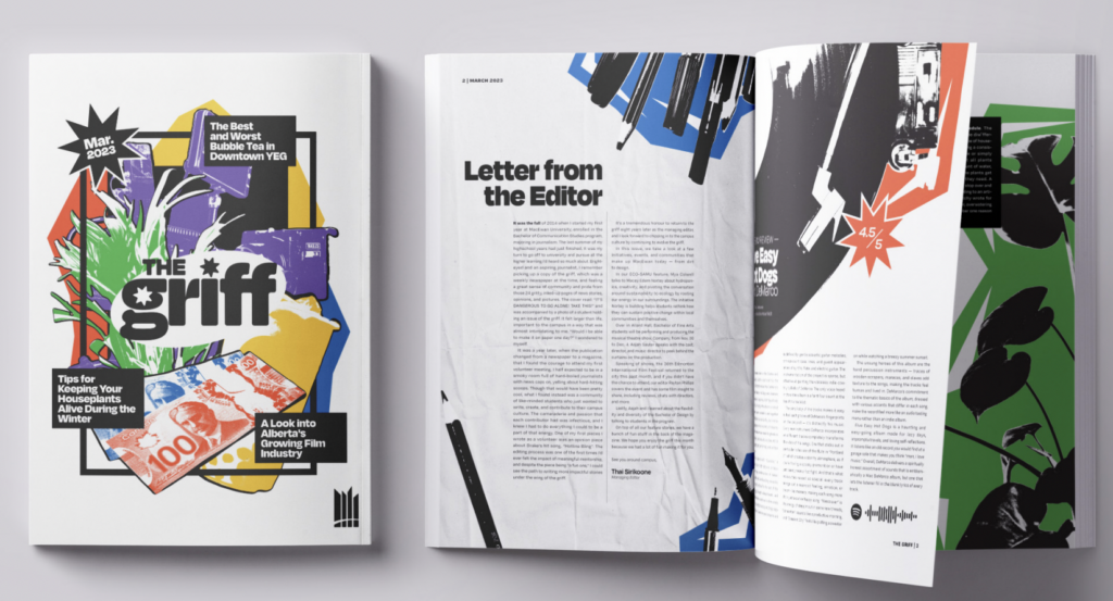
The goal of my redesign of the griff is to bring a bold, creative, and playful energy to the magazine to express the diverse and colourful experience of university life against the urban backdrop of downtown Edmonton.
My sample of this magazine exemplifies the variety of content that may be found in an edition of the griff in a given month. This hypothetical March edition of the griff puts a spring spin on the bold colour palette. Teal, light green, and yellow, along with this month’s motifs of daisies, are found throughout the magazine, unfying the spreads. This unifing colour palette and motif would change every edition, reflecting the season or topics explored in the magazine that month; the colour of the new nameplate is adaptable for this as well.
The text design communicates the ideals of play and openness. The three-column grid allows for a variety of layouts for the text, and the possibility of white space or interacting visuals. Ice Cream and Roc Grotesk are the title typefaces, used in turn or in combination to create variety and dynamism in the magazine design. Having two bold title typefaces, one serif and one sans-serif, allows for flexibility, conveying the goal of diverse expression through the ability to choose the best way to convey an article. The body text is in Gelica, a playful and retro rounded serif typeface, that adds to the dynamic energy.
The visuals are a combination of photography, collage, and illustrative elements. Collage evokes hands-on creative expression and experimentation, with photography grounding the design. Each article has its own identity, but all are connected by the throughlines of a shared colour palette and visual technique.