“Magazine design is right at the intersection of art and science,” says Amélie Dufresne, a recent graduate of MacEwan University’s design studies program. She would know — before getting into design, she earned a Bachelor of Science degree and worked in the field as a geologist for five years.
The point is that a lot goes into a magazine. There’s the stuff you see — the writing, photography, artwork — and the stuff you still technically see but tends to only register in the less conscious parts of your brain — the grid, typography, page hierarchy, and a bunch of other terms that I only just learned the meaning of while conducting the interviews for this article.
In the 2019 winter semester, Dufresne and the rest of the Publication Design class were tasked with redesigning the griff to demonstrate their far superior grasp of these terms. Some of the students agreed to share their finished products, the design decisions that went into them, and the criticisms they had of the old issues of the griff they looked at for reference. Let’s take a look at these, try to get some insight as to what the griff is doing right, what it’s doing wrong, and what it could be doing, without as many budget constraints, *cough*.
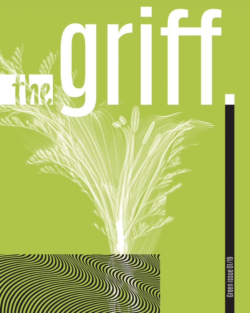
“Green Issue” by Caitlyn Scaman
The majority of the designers I talked to, including Caitlyn Scaman, decided to go with themed issues, which is immediately a pretty big departure from how the griff usually does things.
While from a journalist’s perspective, coming up with enough stories confined to a single topic to fill a magazine every month would be very difficult to manage with our resources, the idea works very well from a design perspective. Graphics, images, and colours can all be selected to match the content, giving the whole issue a cohesive feel, which looks nice and helps people get a sense of what they are going to be reading about just by taking a glance at it.
The Green Issue is a great example of this. While the title refers primarily to its content — Scaman selected stories from the archives that had to do with sustainability and the environment — the magazine is also literally green throughout.
“The first design decision I made was that all the colours in the magazine would be green,” she says. “Each section is a different shade.”
The colour may be a fairly obvious thematic choice in this instance, but it gets the job done. The bright lime cover, first of all, is almost blindingly eye-catching. The rest is more subtle, with just enough pictures of leaves and little green-coloured accents to add a bit of interest to all the words, and to plant the seed in your mind that whispers, “Hey, nature is actually kind of nice to look at and maybe we should do more to protect it.”
The layout of the issue is what Scaman calls a “modular design,” which consists of “basic shapes, less clutter, and a lot of open space on the page.” This is intended to give the magazine a modern look, which is a pretty popular trend, especially among magazines geared towards a younger crowd. But, in order to achieve the consistent theme, Scaman had to do some work to reconcile this layout with the rest of the design and the articles themselves.
“Because the content was about nature, I found that it clashed a bit with the modern style I chose,” Scaman says. “I incorporated patterns and abstract graphics to try and bridge that gap.”
As a side note, the Green Issue’s table of contents also suggests a “memes, comics, and more” section, which is probably a good idea.
“Wellness Issue” by Laura Wunderli
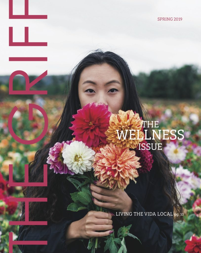
The theme of “wellness” for a magazine has the benefit of being vague enough to leave open a wide range of options for article topics and visual styles, but still concrete enough to give a feeling of what you’re going to get out of reading it.
Laura Wunderli’s issue delivers on this initial feeling, in this case by using a bright yet unabrasive colour scheme, keeping the amount of text on the page to a relative minimum, and featuring lots (the right amount) of pictures of food.
“I wanted something that was really vibrant and vivid, so it’s very visual,” says Wunderli. “I wanted students to be able to just like flip through and say ‘oh, I’m just going to glance through this article and then move on,’ because that’s how we read magazines. We often don’t read them like books.”
The images do most of the work visually, but the layout also helps to keep things dynamic by switching up the way columns are aligned and placed around the page — more for simple variety’s sake than with any thematic intent.
Like some of the other designs, Wunderli opted to include an “events” page, which briefly lists some of the things that are going on around Edmonton. Uniquely, however, even the content of this page conforms with the theme: “This month, we’ve provided a list of indoor events to keep you cosy,” reads an editor’s note on the page, above a list of board game nights and poetry open mics that conform with the articles’ focus on self-care.
“March 2019” by Hannah Alys
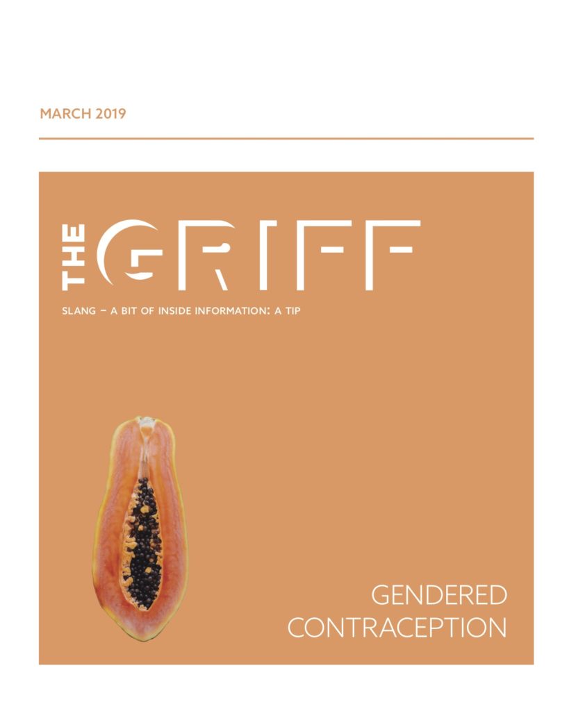
Hannah Alys redesigned last year’s March issue with a very particular use case in mind.
“Whenever I read magazines, I like to cut things out and put them up on my wall as collages,” she says, “so I designed all these pieces of content — whether it’s pieces of the text or a picture or even just a quote — that you could take out and would be fun and interesting all on their own.”
Compartmentalizing all the different components came with the added bonus of giving the whole thing a clean look because it helps to differentiate the sections. The informational pages at the beginning are spartan, which makes sense given Alys’ goal — I can’t imagine many people cutting out the list of contributors for home decoration — but the amount of colour and visual elements accelerate as you get into the meat of the issue. This, she says, was also her largest departure from the griff’s current design.
“I thought it could have used some visual hierarchy,” she says. “When you make titles and things really pop out, it draws the reader’s eye around to the most prominent parts of the issue.”
Indeed, the titles of each story and section are immaculately big, each use different and elaborate fonts, and are more colourful than anything else on the page, while stand-out quotes are also accentuated and detached from the rest of the text.
It all comes to a head when you get to the cover story, where each page is on a different brightly-coloured background, essentially highlighting the entire article. The suggestive pictures of fruit add even more colour, and are a great solution to the problem of having to find images to accompany a story about contraception that won’t get your magazine censured by the university’s administration.
“You want people to get dragged into it,” she says, and by ramping up the visual elements as you get into the more information-heavy and in-depth stories, she was “able to experiment and play with it while still keeping the structure.”
“Re-charged Issue” by Brooke Langmaid
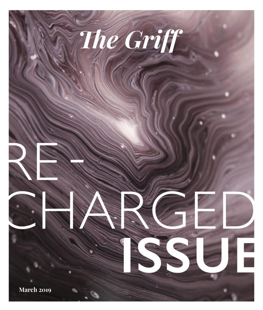
One of the first things you’ll notice flipping through the Re-charged Issue is that the titles of every article received elaborate, unique, full-page graphical treatments — for an article about the Dirtbag Café, the letters of the title are arranged sort of like their rock climbing wall’s handholds, for example. Besides those, however, the layout and visuals are actually quite minimalist. Langmaid says the foremost goal of her design was to find the “balance between not flooding the text with so many visuals, but not having it feel empty, like things are floating in an abyss of a page.”
“In publication design, it’s super easy to want to fill the whole page up as full as you can,” she says, “but I found making sure I gave it enough breathing room was one of the most important things.”
To this end, the more text-heavy pages have a lot of white space, are pretty light on colour, and have just a few small graphics — something as simple as coloured dots or Xs scattered around the edges, “to make it just a bit dynamic,” says Langmaid. For the most part, the articles are left to themselves.
“When the magazine is crowded, you don’t know where to look first,” says Langmaid. “My way, you still get to have all the cool graphical stuff, but you just find your big title, and the rest of the text is easy for your eyes to follow.”
The theme “Re-Charged” refers less to the content of the issue and more to Langmaid’s intention with the project. Rather than making drastic changes to the griff, she says she wanted to ramp up what was already there.
“I found the content was good. It just needed to be elevated a bit — like it had gotten a facelift,” she says.
“January 2019” by Krista Niemi
When Krista Niemi’s mother first suggested she pursue a career in publication design, she said: “Hell no. Who do you think I am? I’m going to hate that.” Instead, she went after fine arts. However, it didn’t take long into her post-secondary for her to realize her mother may have been right.
“I found it wasn’t enough for me because I don’t like to do things just to make them look pretty. I like for them to have a purpose,” Niemi says.
It was this idea — of considering the purpose of a project — that informed her redesign of the January issue from 2019.
“It starts with the audience. When you’re writing an article, you have to think of who’s reading it. I thought about how they would interact with the magazine, and where that would happen.”
The audience — mainly students — tend to lead lives that are somewhere between busy and hectic. The function of the griff, in Niemi’s mind, should, therefore, be to “give you a little break from being stressed out.” In terms of the design, this meant including a lot of imagery relative to the amount of text, simple graphics and layouts, and “adding excitement through colour” — washing the entire issue with a rainbow palette. This variety of colours also plays an important organizational function, as each section of the magazine is distinguished by which colour is dominant on their respective pages.
The other major change Niemi made was to the magazine’s size. Making it smaller, she says, would also be better suited for students’ lives — especially hers.
“I’m known to be that Mary Poppins person — I’ll carry a whole bunch of stuff with me all the time. ‘Does anybody have this?,’ and I’m like, ‘just give me a moment,’ and I’ll probably pull it out from my purse,” she says. “The current physical size can be a little inconvenient considering how many books you might have and all the stuff you have to carry around — all the snacks to keep you alive during studying. So I felt like making it a little bit smaller would be convenient just because it doesn’t seem like an extra book that I have to carry around.”
“Creativity Issue” by Amélie Dufresne
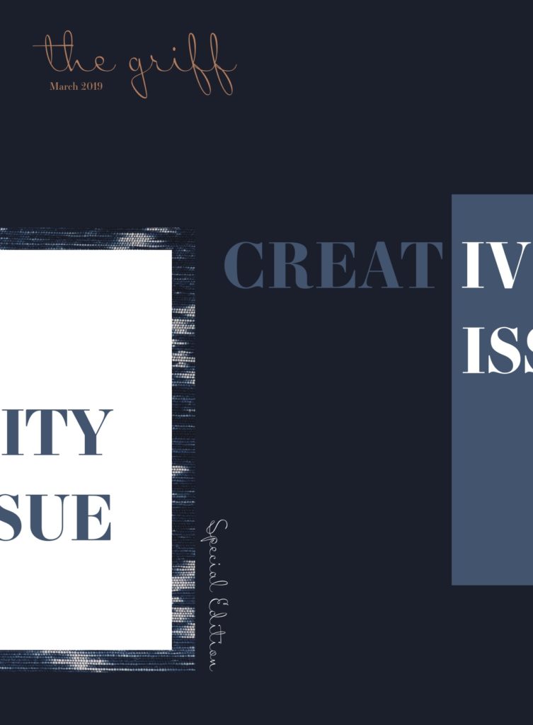
Here is another themed issue, this time compiled of stories about the arts. This is a daunting premise for a design project right from the beginning, as its title and content demand a level of visual creativity that exceeds the usual amount required for good magazine design. Luckily, this one follows through, mostly by messing with the way everything is arranged.
“I noticed (the griff) was sometimes kind of static with its layouts,” says Amélie Dufresne, “I thought it could be more fun — more playful.”
Far from being static, much of the text, images, and graphics in the first few pages of the issue are disoriented, cut off, and generally placed in unconventional ways that make the reader take a second look.
“I wanted it to look like a work of modern art,” Dufresne says. “I was targeting a bit of an older audience than you might see with the griff and other student magazines. It’s a little more sophisticated, so it’s for the faculty as well as the students.”
Appropriately, the colours here are a little more muted than some of the other designs, the graphics themselves are not too elaborate, and the layout calms down a bit once you get into the longer articles, but it keeps the sharp rectangular shapes and still occasionally cuts off a quote or an image — enough for the issue to retain its identity while still allowing the text to be readable.
For images, Dufresne decided to accompany the sections, which largely discuss artistic pursuits of different mediums, with closeups of corresponding textures and materials: a strip of denim beside the letter from the editor about do-it-yourself sensibilities, some patina as the banner for an article about copper jewellery.
“It adds intrigue,” she says. “You have to look at it for a while before you figure out what it is.”