Sometime in the middle of July, a blanket of metal spikes was bolted onto the set of concrete benches just outside the CIBC on 101 St. and Jasper Avenue. The company offered a reason for installing them — notices were posted in the area indicating the spikes were to encourage social distancing by keeping people from gathering near the bank’s entrance. A more likely explanation is that they were put there to keep the area’s relatively large homeless population from using the benches to sit or sleep on.
“They posted notes outside saying there would be no seating due to COVID-19, which I really questioned because they just installed these a few weeks ago and we’ve been in the pandemic for five months,” says urban planner Amos Kajner-Nonnekes. “It’s really about trying to exclude certain groups of people from the space.”
Kajner-Nonnekes called the spikes, which were removed on July 31 in response to a public campaign he helped get off the ground, “barbaric,” and it’s not hard to see why. Visually, they were striking, unsightly, and reminiscent of medieval torture chambers. Besides the message of exclusion directed specifically at people who are forced to sleep in public spaces such as these, they gave a sense of unwelcomeness to anyone in sight, regardless of housing status.
“A lot of us planners have been working towards creating an inclusive and safe downtown — a downtown that is vibrant and inviting. This went against all of that,” Kajner-Nonnekes says.
The spikes were an obvious issue, and almost immediately inspired a public campaign to have them removed. However, they were merely one particularly aggressive instance of a growing, international trend in urban design called “hostile architecture.”
Even if you have never heard the term, you have seen hostile architecture before. Once you start knowing what to look for, it’s hard not to see it. There are other cases of violent-looking metal spikes or studs, such as those that started plaguing storefronts in London, England around 2014, but most of the time, it takes much subtler forms and is everywhere you go.
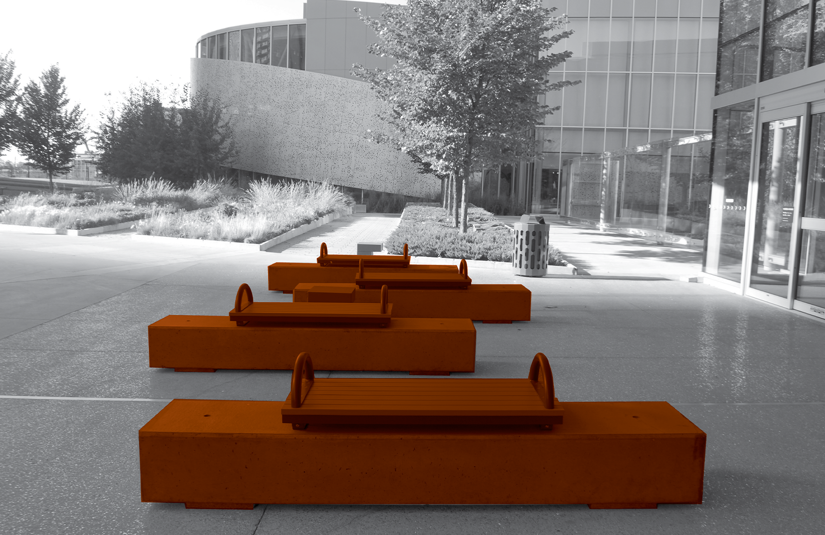
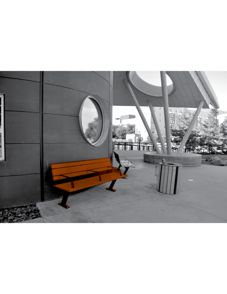
“If you’ve ever sat on a bench that has centre armrests, those are usually there to keep anyone from laying down,” Kajner-Nonnekes says. “Sometimes it’s something as simple as the seats being inclined at an angle so they are uncomfortable to sit on after a while.”
You may have noticed small, seemingly decorative concrete or metal ridges jutting out at intervals along a ledge, or been puzzled as to why a store’s awning has a gap up against the building that lets some of the rain through. A San Francisco restaurant was criticized last year just for putting out a decorative boulder because it turned out to be strategically placed in a sheltered alcove where someone could ostensibly sleep. The City of Seattle was criticized in 2018 for putting up bike racks because they were located in the exact spot a homeless camp had been cleared out by police only a few days earlier, and The Guardian reported that the transportation department had coordinated with police to have the racks ready to install as soon as the area was cleared. Even something as inconspicuous as rows of planters or other decorations placed down the middle of a sidewalk might turn out to be hostile simply for squeezing out space and directing foot traffic through the more sheltered side away from the road.
The term “hostile architecture” doesn’t even encompass the full range of the problem (some prefer “defensive design”), as it isn’t always tactile. Kajner-Nonnekes recalls a high-pitched ringing noise that used to be played regularly around the entrances of the Southgate LRT Station late at night to discourage people from sheltering inside. The use of similar noises has been publicized in Winnipeg, Toronto, and Portland, Ore. over the past couple of years, and as early as 2009 in New Westminster.
The tactic is varied, sophisticated, and can easily go unnoticed along busy streetscapes.
Whatever form it takes, the goal is always the same: rendering a space inhospitable to whoever or whatever could be perceived as harmful to business — often this means homeless and transient people, but to a lesser extent skateboarders, smokers, loiterers more generally, sometimes even birds or other animals. The net effects are always the same too: homeless people are disproportionately negatively affected, regardless of the intended target. It isn’t all that tragic if a smoker has to relocate to an alley, after all, but people who live on the street are much more reliant on these spaces.
To Kajner-Nonnekes, who leads an urban design studio called Design, et cetera that works in part to make “public spaces that are vibrant and inclusive to everyone,” he says, hostile architecture is a “cruel way of treating some of society’s most vulnerable people,” and, as the name suggests, it heightens tensions and adds to the greater feeling of hostility that homeless people face already.
“It’s saying ‘I know you need somewhere to go, but you can’t come here,’” he says.
Essentially, hostile architecture turns homelessness into a technical problem for store owners and other commuters to deal with, rather than the tragedy of people not having their basic needs met. And, it’s not even likely to resolve whatever issues there might actually be between the people it’s targeting and the people it’s supposed to benefit.
As an example, on Twitter, CIBC offered another reason for the spikes, saying, “The safety and wellbeing of our clients and team is a top priority and we occasionally implement additional safeguards to support that commitment.” What exactly the threats to safety and well-being were was not specified, but such vague concerns are a fairly common justification for hostile architecture as a whole. Often, these amount to a mere discomfort at the sight of homeless people and the inequality their presence indicates, but either way, hostile architecture is a non-solution.
“Of course there can be tensions between property owners and some of the people that use their space,” Kajner-Nonnekes says, noting that CIBC had also said there had been several ill-defined “altercations” outside of that branch in the days before the spikes went up. “All taking away common space is doing is pushing those tensions on someone else’s doorstep, which isn’t the way to deal with a person who needs to sleep on a bench and certainly isn’t the way to solve the underlying problems of homelessness.”
Even worse, the removal of common spaces has a tendency to erase the actual issues.
“We’re pushing it out of sight, out of mind. If we don’t see those populations in our area, then it becomes not a problem for us, and they just have to go somewhere else,” Kajner-Nonnekes says.
So what is the solution? Of course, a city can’t design its way out of homelessness, but while he notes the preeminence of things like supportive housing and addiction services, Kajner-Nonnekes says there are productive things that can be done on the street level to better accommodate people’s needs. The first is obviously to reverse the trend towards hostility, but after that, he says making public spaces inclusive gets a little more complicated since meeting peoples’ needs changes depending on who those people are.
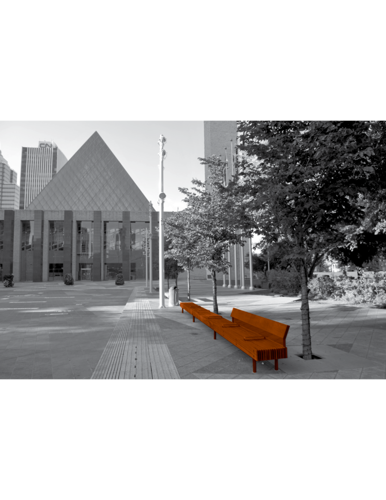
“We know already that benches with centre armrests aren’t inclusive to people who are forced to sleep there, but benches without armrests might not be inclusive to elderly people or anyone who might have a hard time standing up,” he says. Without any list of urban design rules for inclusivity that can be applied universally, the only real solution is to include the groups that use the space in the design process itself.
“Once we start designing for people instead of designing with them, then it’s a broken process, especially marginalized individuals because they have different needs than the people who are most likely to be doing the designing, and they use that space differently,” he says.
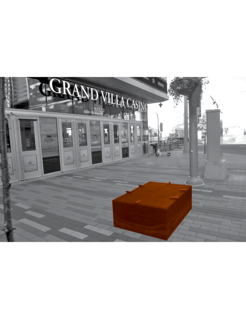
On Twitter, Kajner-Nonnekes also offered to redesign the space in front of the CIBC for free or for a fee that he would then donate to Boyle Street Community services, to which he says he hasn’t received a response. In the meantime, he also has a plan to manufacture portable seat cushions that could fit over the spikes and other fixtures like them. In the bigger picture, however, the problem isn’t solved by taking care of spikes as they pop up, but by paying greater attention to public spaces, how they are designed, and what functions they serve.
“It’s easy to look at the extreme forms like spikes, and know that needs to change,” he says. “That being said, we can’t forget about the little things like those centre armrests and the impact they have.”


0 Comments